Color Psychology and Its Impact on Design Portfolios
This edition’s theme: Color Psychology and Its Impact on Design Portfolios. Explore how palette choices steer perception, trust, and action across your showcase, and learn to wield color intentionally to tell a persuasive creative story. Join the conversation, subscribe for updates, and share your own color wins.
First Impressions: The Psychology Behind Your Portfolio Palette
Warm hues such as reds and oranges can signal urgency, energy, and boldness, while cool blues and greens communicate calm, reliability, and clarity. Decide which emotional doorway you want visitors to step through before they read a single word. Tell us which mood you want to lead with.
Translate desired actions into color choices. For inquiries, consider confidence building blues, while experimental briefs might welcome vibrant magentas. Define primary, secondary, and accent roles so visitors intuitively find contact buttons, case studies, and your process narrative. Post your top goal below.
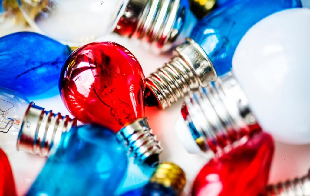
Palette Strategy: Mapping Emotions to Portfolio Goals
Use contrast to guide scanning and reduce friction. High contrast callouts draw eyes to calls to action, while mid contrast sections support comfortable reading. Test accessibility ratios to balance inclusion with impact, then refine spacing to avoid visual shouting. Subscribe for our contrast checklist.
Palette Strategy: Mapping Emotions to Portfolio Goals
Stories from the Field: Portfolios Changed by Color
A UX freelancer replaced aggressive reds with teal accents and saw inquiry quality improve within a month. Prospects described the work as clearer and more thoughtful, less rushed. The palette reframed value toward guidance over speed. Share your before and after palette wins and lessons.
Microstate colors should confirm intent without jolting users. Shift saturation instead of hue for hover, deepen shade for press, and use clear yet tasteful focus outlines. These subtle rhythms build trust and confidence. Comment with your favorite interaction color pairs and why they work.
Curating Photography to Match Your Palette
Desaturate or color grade case study photos to echo brand hues and avoid clash with interface elements. Consistent temperature across thumbnails builds cohesion and trust. Consider a controlled accent in captions. Share favorite grading approaches that make your portfolio feel unmistakably yours.
Illustration Styles That Carry Emotional Weight
Flat pastel illustrations can project friendliness and openness, while textured vectors suggest craft and care. Ensure stroke colors and fills respect palette hierarchy so decorative elements never compete with evidence. Which illustration mood best complements your projects and strengthens perceived expertise.
Gradients and Blends Without Losing Clarity
Gradients add motion and depth when anchored by reliable neutrals. Limit transitions to neighboring hues or disciplined triads to avoid muddiness. Keep text over gradients high contrast and test on small screens. Tell us how you maintain gradient accessibility without sacrificing expressive impact.
Measure, Learn, Iterate: Proving Color Works
Rotate accent colors on calls to action across comparable traffic, then measure completion, time to click, and aided recall in quick surveys. Small shifts can unlock meaning and momentum. Share your testing plan and we will highlight creative experiments in upcoming posts.